
Dear Designer,
A good friend of mine asked me a question last week that gave me pause.
“If you were 30 years old, would you pursue graphic design as a profession?”
It’s a profoundly important question.
I didn’t study design. I went the art school route and was fairly successful until I wasn’t. It was only when my wife and I decided to have a family — and when I was laid off in a massive post-9/11 recession — that I thought about design as a career. I had always designed and made visual objects but I jumped head first into design in my early 30s. (I hit my head at the bottom of the pool a few times.)
The length of time to answer my friend’s question in my gaping hesitancy to respond was noticeable.
Would I pursue graphic design if I was 30?
Saying yes to design.
I said yes.
At least for the next five years — and anyone predicting a world beyond that in a time of momentum and madness has to have a last name of either Kurzweil or Lama.
I don’t see graphic design going away any time soon.
It cannot.
It will be with us. Design jobs, including freelance, in-house, and agency work will continue to be available. I wrote about this in a few previous issues.
 Andrew Boardman
 Andrew Boardman
 Andrew Boardman
AI will not destroy design.
It will not. But there is a good chance that good design — and by that, I mean innovative, high-minded, strategic and forward-thinking graphic design — will change. Perhaps even for the better.
One path forward is to embrace constraints as a designer by driving into what design does best — build real and lasting connection with others and an organization, a brand, a state, or a community.
If we look at the current state of photography in a graphic design context, we see a mishmash of grotesqueries driven by a metastisization of technological adoption, the ubiquity of image-making devices, the rise of online stock factories, and the capacity for generative AI to dream up literally anything.
Taken together, I believe that we are starting to see designers eschew the photographic and the plainly imagistic — and the rebirth of written content that is meaningful and even magical. In other words, authentic (a word I myself try to eschew).
Yes, I know that that copy will be and is generated by LLMs in graphic design applications. Yes, I know that most people (including you and I) will increasingly find it difficult to distinguish good writing by an AI from good writing by a human. But we should put that aside, as we think about what design looks like for the next five years.
And I think it’s typographic.
The web was words
In the beginning, there were words. The Internet began as a text-based system of interconnected computers. It was an index. A catalogue. A well-reasoned, curated construct of human ingenuity, the start of a collected striving, all set in text.
Not necessarily beautiful then — but fascinating today.
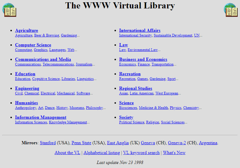
The World Wide Web was first made of (blue) words. Later came icons and images, illustrations and lines, Flash and all kinds of flotsam — a flurry of visual ephemera piled up and piled on.
It was beautiful madness, the web.
It still is.
There will be words
But the indexical structure that made up the early web and that gave rise to search engines, SEO, and technical stability is now going away with AI.
The totality of our collective digital intelligence has been sucked up by the great thinking machines and, in that vacuum bag is our culture and our capabilities.
The web that have we have designed and built, the web of words and images, of ideas and ideals and information, is part of the great expansion that is artificial intelligence. (The intelligence of LLMs is not artificial at all; it is all too human. And it was stolen from us by a few trillion-dollar companies.)
Moreover, as people continue to shift from searching the web to asking a bot what to do, how to act, where to go, who to be, and why to live, the LLM’s will grow.
And what the LLMs will need is not pretty websites but text-based ones. If people are searching on LLMs, they won’t need the web. They will just need a pretty interface where they can write and read.
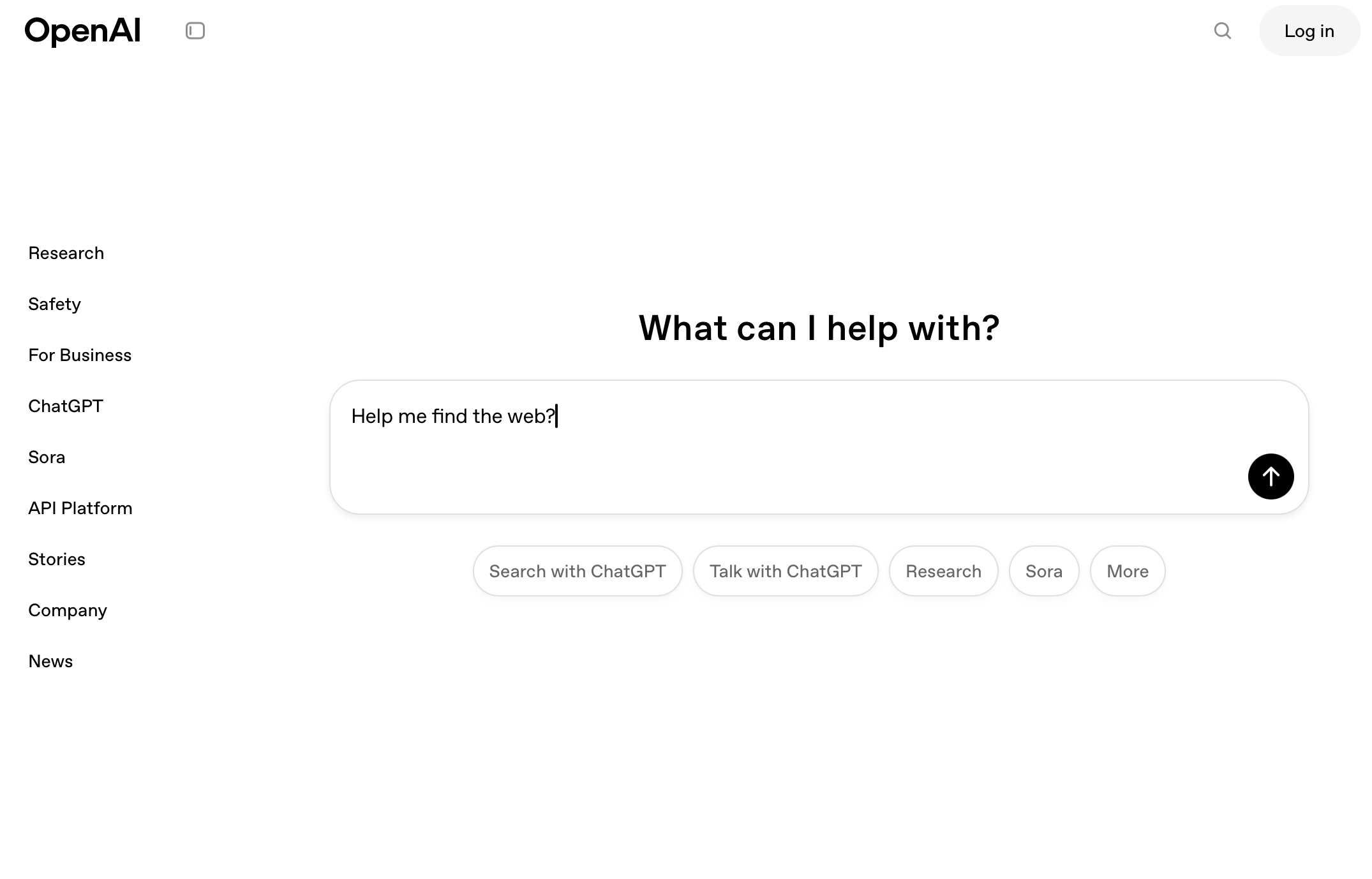
So, if I my logic is correct, the ultimate future of the web — and the end state for web design — will be plain pages of text.
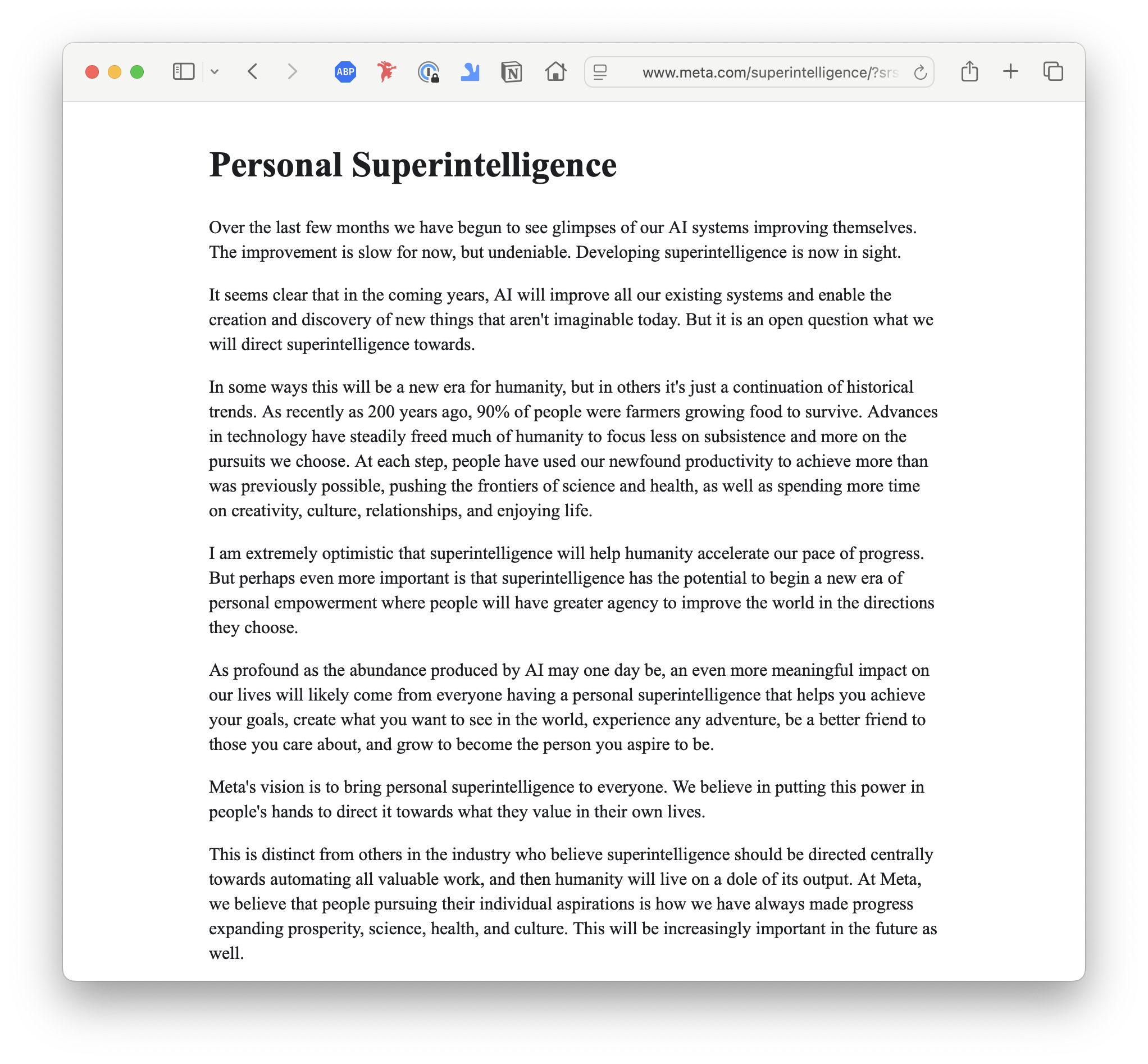
Mark Zuckerberg in his infinite wisdom made this clear a few days ago with his (not particularly well-written nor perceptive) blog post that looked like it was written in MS Word.
Typesetting matters
Until that time, when everything web looks like Z/Yuck — and I think it’s at least eight years from now — it’s worth thinking about words.
Going to back to typographic basics is key. Dear designer, we need to start afresh and think about text, type and truth.
How are you using your words? What do they look like? How are they reading? What are you doing with them? How are you styling them? What makes your copy readable? How is your text legible?
Who is reading? Why are they reading this? Should they read more or less? If it’s more, how much more? If it’s less, how can you minimize?
Text and trying
Rethinking our relationship with text and type can be invigorating.
Constraints, like me, is your friend.
Type alone can do almost all of the work of design — emotional, informational and experiential.
For your next project, consider using type only. I’d love to see it.
Yours,
P.S. Last week, I talked a little bit about having a new pricing tier here for people who want access to certain paid projects. I am still considering this. But I should mention, I am also considering moving to Ghost, a nonprofit Substack alternative that just released a massive new update and is starting to build community and not just platform. And they don’t have as many Nazis there.
Image of the Week
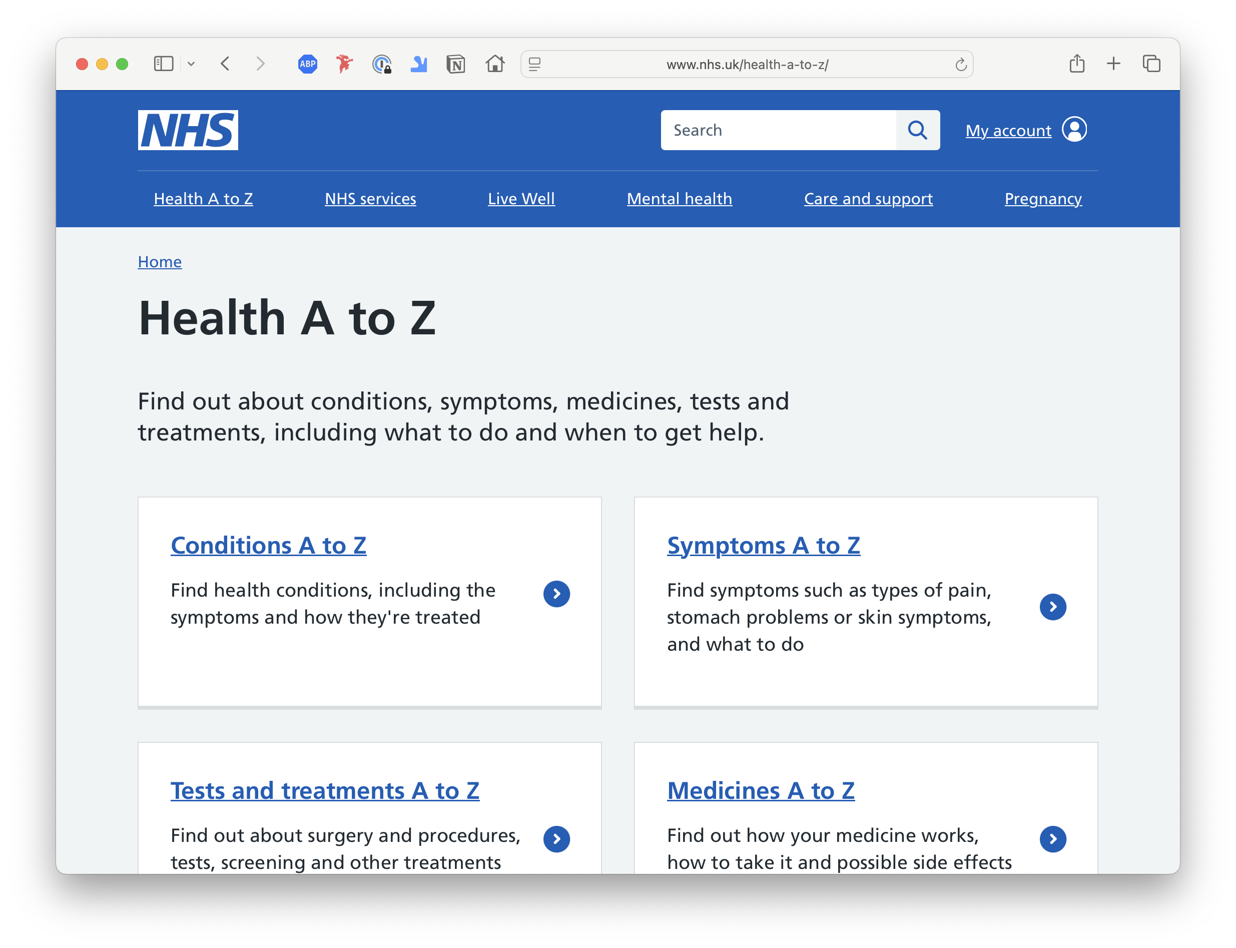
Boring, but so, so helpful, the U.K.’s National Health Service website is a model of constraint and conscious design. When I had real health challenges a few years ago, I relied on this site to guide me about medications, symptoms, and good questions to ask my doctors. I literally trusted it with my life. There is not too much higher praise than that.
Quote of the Week
Content precedes design. Design in the absence of content is not design; it’s decoration.
~ Jeffrey Zeldman
Thank you again for subscribing, dear designer. If this newsletter was forwarded, you can get your very own subscription by pushing this button.
You can also share this post with this here button.