
Prologue: Thanks to you, dear designer, my post The Time for Yourself is Now, garnered 45 likes and comments, each of which I promised would generate $1 for Wikimedia. I donated the $50 to the Wikimedia Foundation as a show of solidarity with their project of keeping information free, alive and objective. Thank you to everyone who read, liked, and commented.
Also, it’s been a noticeable while since I’ve written. I’m committed to this newsletter project — enough that I am planning a move to a new platform (Ghost) in the coming months.
I like Substack. But it’s beginning to go off the rails and I can see a near future where it will not be able to sustain itself as it continues to enshittify. Ghost is more independent than Substack, is not taken with Nazis, and is less a social network (which are exhausting me) than a nonprofit publishing platform. I’m getting there — and I promise not to ghost you.
Dear Designer,
When I was about 14 years old, I remember receiving an insult that stuck deeper than I would like to admit. I was hanging out with a “friend” at their house, listening to various albums — probably a combination of “The” bands before “The The” (The Doors, The Who and The Stones) — in his huge bedroom in this huge house on the wealthy part of town.
And in passing, my friend said I was boring. Boring.
Yeah, I know my last name is Boardman haha. It’s funny but not the point. I probably should have been expecting that at 14 and, perhaps now, it should mean much less to me than it did or does.
But to be called “boring,” for me, is a stabbing that cuts clear through the ligaments, into the muscle, and then the bone.
Maybe I was boring. I don’t remember where the insult came from exactly. I certainly did not think of myself as boring. Like a lot of independently directed kids, I thought I was pretty cool at 14.
Why does “boring” get such a bad rap and why was I so pained — even to this day?
First, even in the 1980s, our crazed culture demands a certain level of expressed individuality. Sometimes this devolves into a kooky cult, as we witness with today’s outlandish followings of political leaders and social influencers.
We love people that stand out, stand up, and have something (seemingly) important to say. We adore the public speaker, the creator, the meaning-maker, and the debater.
Even the most high brow among us celebrates individual genius and we genuflect before great artists. (A recent book from Harvard Business Review Press is entitled There’s Nothing Like This: The Strategic Genius of Taylor Swift.)
We are told that each of us is “unique”.
But if we take that apart, of course, this means that none of us are really unique.
And to say we are all truly unique may stretch the truth just a little.
We are, in fact, mostly and deeply the same, with the same wants and needs, the same demands, desires, and dreams. We are alike more than not. Hospitals, banks, and supermarkets all work because we have the same health, financial and nutritional needs.
In the grand scheme, we are the same by and large — different in the same way that individual ants and alligators and aardvarks are different from one another.
The culture of capitalism tells us each of us is idiosyncratic and we are brought up to each feel demonstrably different from everyone else. But we also know that subjectivity is mostly constructed through language. Talk with anyone — and we quickly find that we are alike the vast majority of the time. It is really the presentation of language, or social expression, that makes us look and feel unique or special.
In this way, it could be said that we are all boring! We are individually the same, each of us making up a whole through the expression of minute differences.
Second, being assigned the characteristic of “boring” may mean and lead to other unpleasant things. Be called “boring” can indicate that you are also “bored” — a stasis that connotes a lack of intent, lack of interest, and even lack of integrity. A person who is deemed bored is often cajoled by friends and family into finding a hobby, creating a work of art, or simply getting outside (I hear my mom right now).
Being “bored” means that you are judged (and presumed guilty) as being underwhelmed by the world, aimless in apprehending it, and inured to its enchantment. Being bored means that you are also, by all intents, useless. And lord, we well know how the indolent and useless are often treated in our society (the addicted, unemployed, poor, unhealthy, migrant, or unhoused).
The boring are dull and the bored are dullards.
The real problem, dear designer, is that we’re all boring.
And we’re also all individually incredibly important and powerful and beautiful. Every ant, alligators, and aardvarks is key to the survival of their families, communities and descendants.
So what does this all have to do with design?
Lately, I’ve stumbled across a new/old trend of website design, which might loosely be called boring. These sites share a few characteristics. All of them are by and for individuals. All of them are grappling with key design-communications challenges. All of them handle ideas typographically and with great attention to detail. All of them deliver simplicity and the confidence that accompanies visual presentation of written ideas.
All of them manage to connect with generosity and encouragement, despite or perhaps because of, their minimalist ethos. All of them are individual designers / writers who belong in and write for community. And all of them connect to a rich and varied tradition of using personal but minimal design to explore space, light, time and meaning.
I would even go so far as to say that each of these designers go beyond their own “individuality” to express what is greater than all of us — an ineffability, presented simply. They showcase their written ideas as an act of visual creation that echoes our short existence in the vast eternity of the universe.
Before I present a few concrete website examples of this minimalist design direction, I thought I would foreground them with a number of great boring (I mean also minimalist) artists of the 20th century.
Mark Rothko
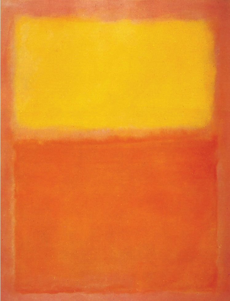
Probably the most important of all colour-field abstractionists is Mark Rothko, a mid-twentieth century painter who created large canvases that show light and dark, beauty and horror, simplicity and complexity in a visually vital way. The paintings are examples of an individual artist contemplating civilization through mythology, history and the potential for transcendence through attention. I have seen many of Rothko’s over the years and they are oddly and strikingly boring. They contain everything and nothing. Rothko noted that “my paintings’ surfaces are expansive and push outward in all directions, or their surfaces contract and rush inward in all directions. Between these two poles, you can find everything I want to say.”
Agnes Martin
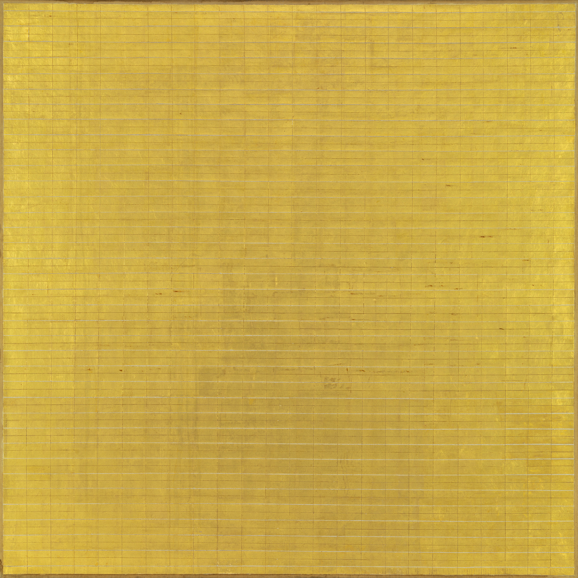
Born in Saskatchewan, Canada, Agnes Martin moved to New York in the 1950s and became one of the most important abstract artists of the century. But unlike other like-minded painters who dabbled in Jungian and Freudian tropes, Martin created works of art that combined Zen Buddhism with American transcendentalism. She wrote that painting was “a world without objects, without interruption… or obstacle. It is to accept the necessity of… going into a field of vision as you would cross an empty beach to look at the ocean.” She subscribed to the beauty of banality — where we are all held, past, present and future.
Barnett Newman

Like Rothko and Martin, Barnett Newman was born over 100 years ago to an ordinary family but he went on to create works of great importance and power. Most of his paintings after 1948 (three years after World War II) consist of large colour fields punctuated with what he called “zips”. The zips were bold lines of contrasting or bright colour that he described as being informed by a nuclear blast and the creation of existence. Newman saw his work much like Rothko, presenting the ineffable as a single human — minimalism as a universal expression by a unique individual. Each of us are living moments and we inhabit a shared fusion of everything that is, ever was, and will be.
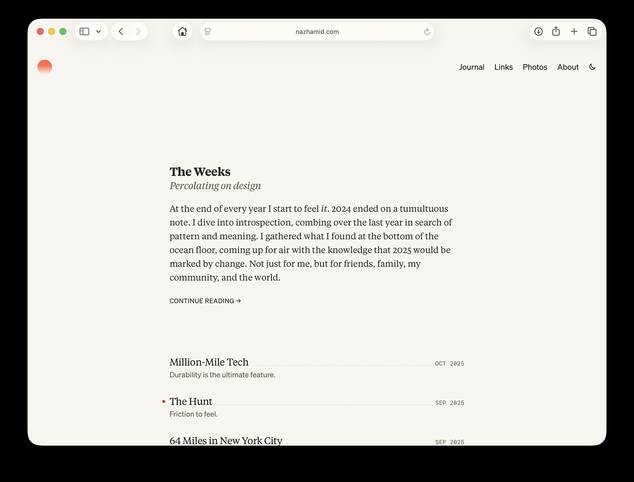
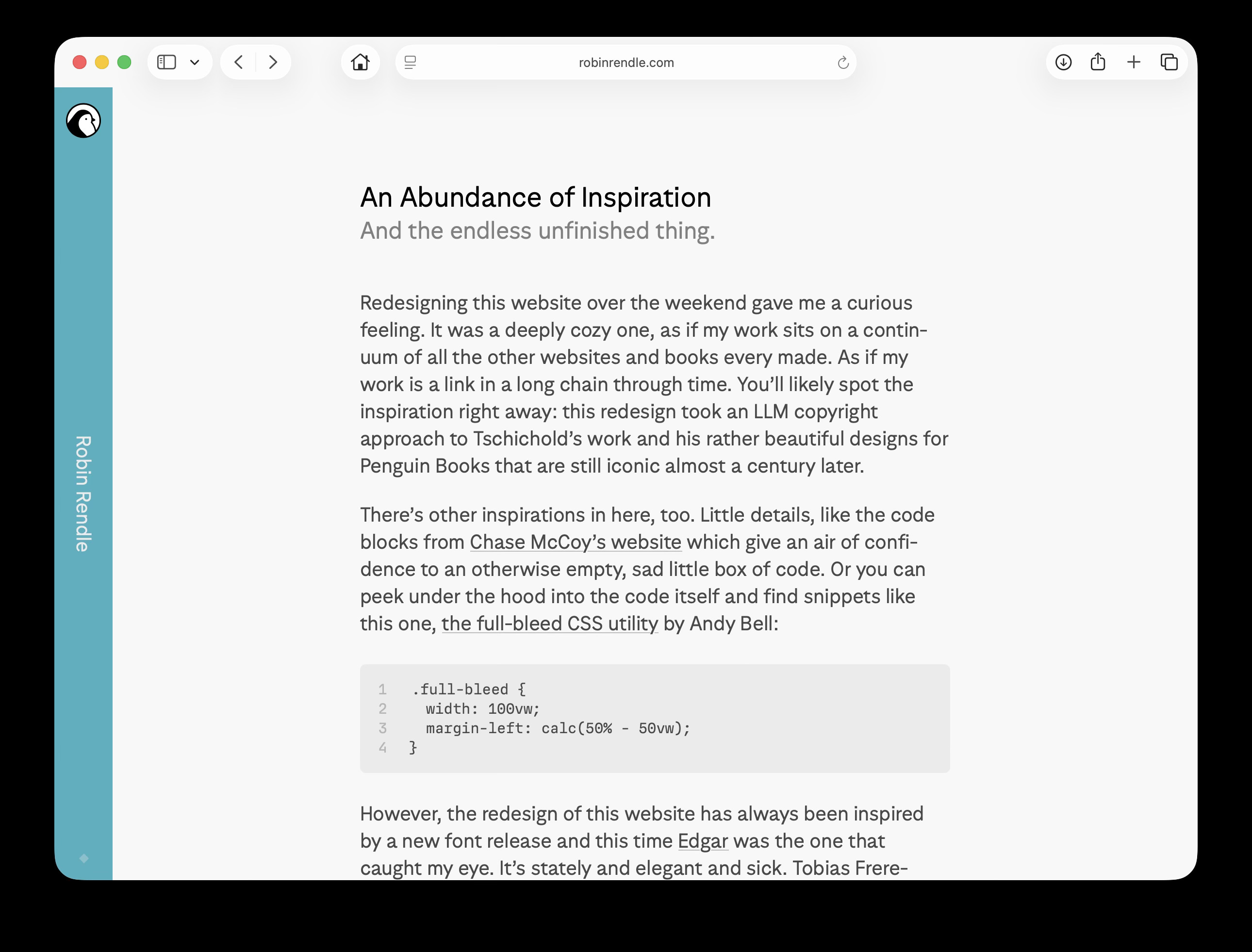
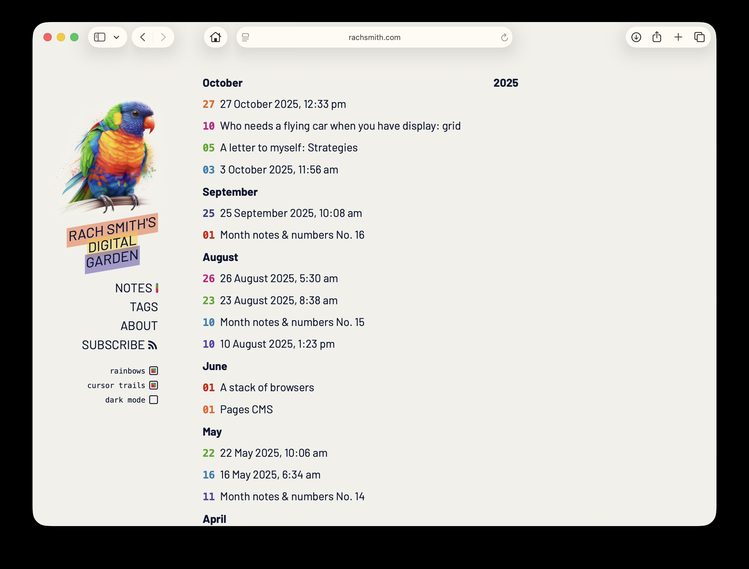
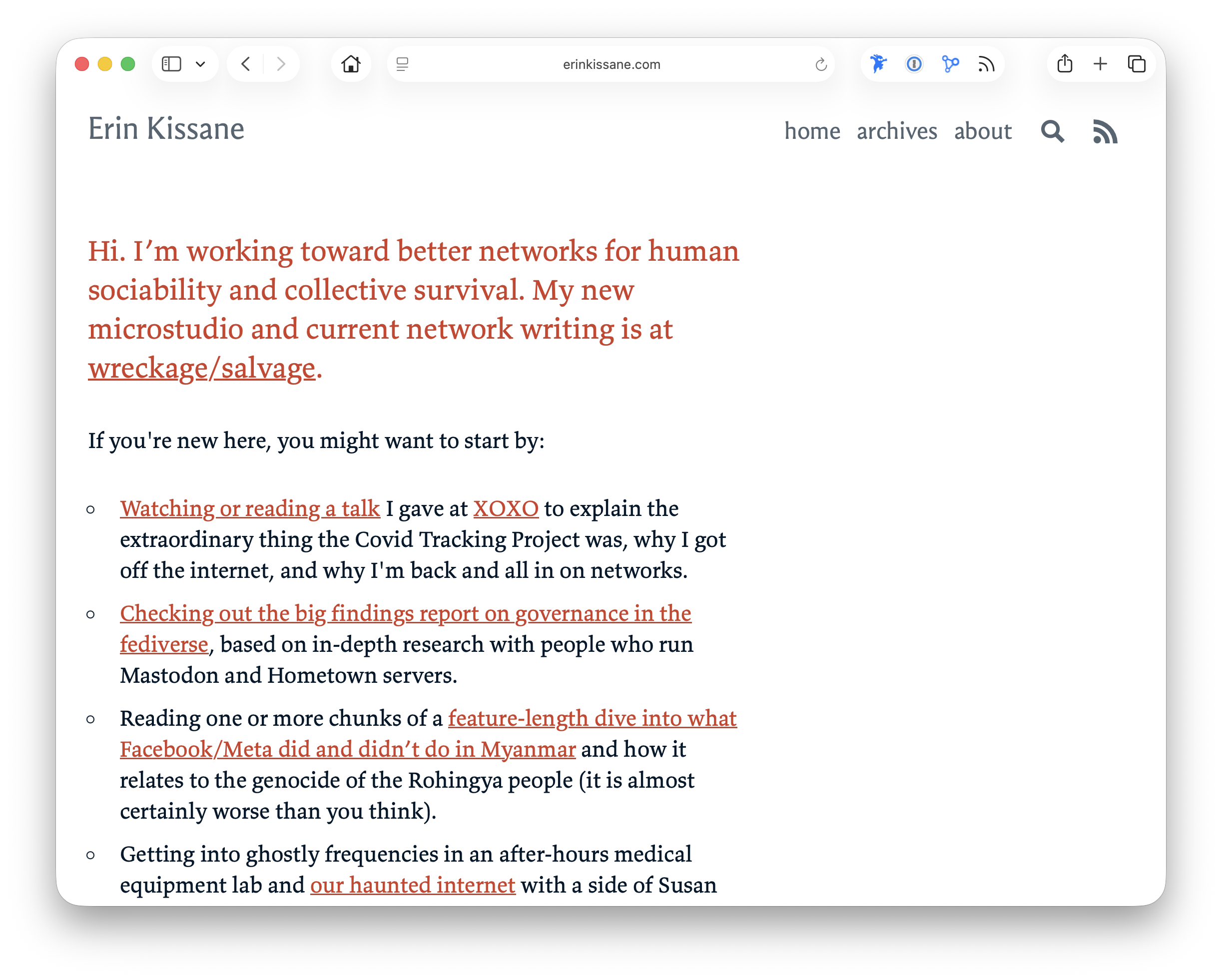
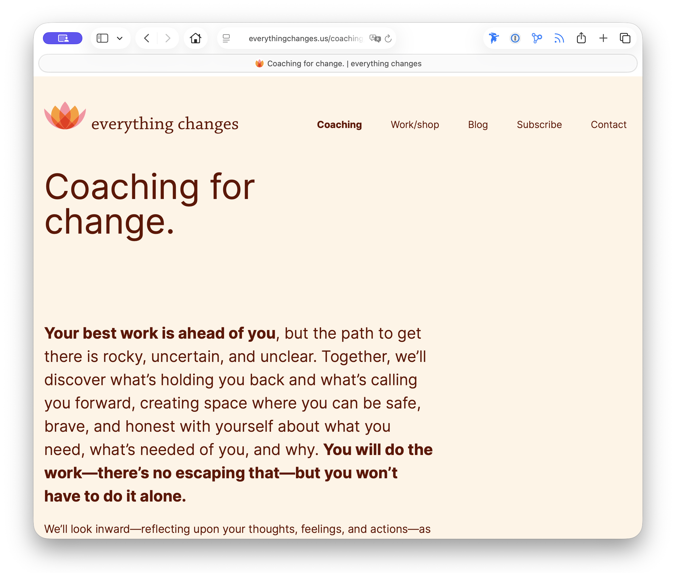
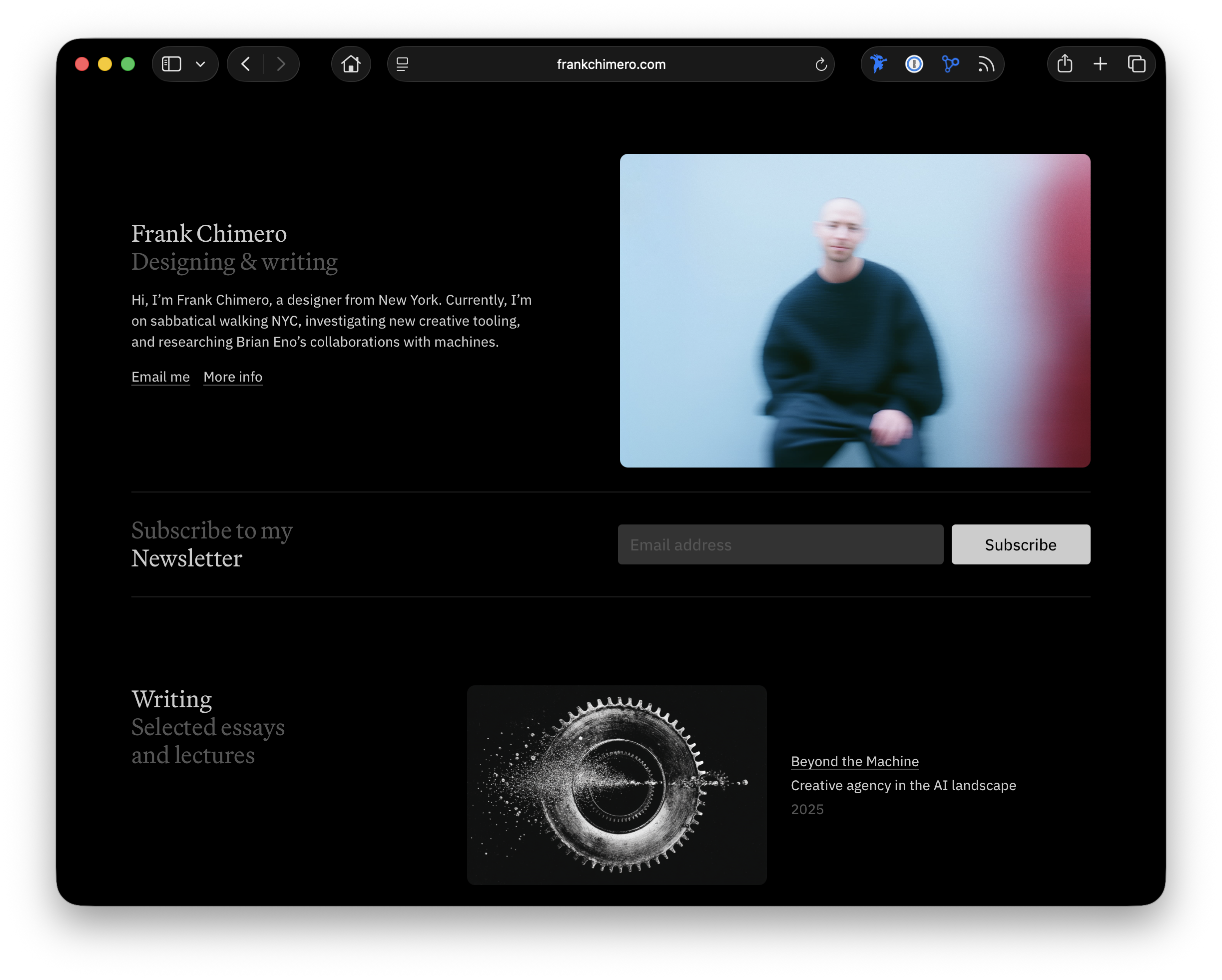
Boring websites
Okay. So here are some of the “boring” sites I’ve encountered lately. I’m not going to over-explain them. Instead, I’m going to present them.
Each of these sites represents an individual who stands tall one day and lays flat the next. Each offers something, to my mind, enigmatic and thrilling in their confidence and love for the art of the everyday. Each delivers a spirited conversation that reflects the author’s imagination and diverse interests. The focus on type and typography is not accidental; these sites fire their thoughts with beautiful fonts and fine typesetting.

Giving thanks, and wishing you a very good week ahead.
Yours,

Image of the Week
Moving forward, I am retiring this section. It was cool to highlight works of art and design from the annals of history. But doesn’t it make more sense to spend time finding images that support the posts themselves? Yes, yes it does.
Quote of the Day
“The problem of a painting is physical and metaphysical, the same as I think life is physical and metaphysical.”
— Barnett Newman (TypeQuote)